30 examples of modern product landing pages
Without a strong design, an online business will not "shoot" - or, will not open up to 100%. The appearance of landing pages is dedicated to the category of our blog - . But today we will look at successful examples of product landing page design.
Pay attention to the role of the "main image" or "hero image" in each example - it lays the selling potential of the landing.
We hope these cases will inspire you to test your own.
1.
The website of the Hebe Boutique designer clothes and accessories store is an example of a harmonious, thoughtful design. The main image immediately attracts attention, and product photos are of high quality. The typography is also pleasing: the font thickness is larger than the standard one, which, together with high-quality photos, gives a solid visual image.
2.
This eCommerce site has a nice color scheme. The developers abandoned the traditional white background, which made the resource stand out from the rest. As in the example above, Ticklers uses great photos. Large, rotating images show how clothes sit and look on real people in real conditions.
An interesting format of social proof - test it on your .

3.
After the transition, it is immediately clear that this is a women's clothing store. The combination of high-quality female photos with info blocks about discounts, promotions, delivery terms and more is noteworthy.

4.
Online store Ada Blackjack sells bags and backpacks. The design is simple, based on good product photos. This layout does not distract from the main thing - the goods.

5. AMBSN
AMBSN is an eCommerce website for selling clothes. Given the high competition, the owners decided to stand out with a bright design - fortunately, the style of clothing allows this.

6. Ryder
Another way to stand out is custom design. An example is the clothing and home goods store RYDER, with a very creative layout (see the menu in the screenshot). It is worth testing how this affects the landing page conversion.

7.
It is believed that the main page should indicate the benefits (free shipping, promotions, sales, etc.) and post photos of popular products. Or just a display case, in a pinch. But looking at Morepork's website, it looks like the company is selling themselves, not their wares.
Perhaps the tactic is justified - it is worth testing it to find out to be sure.

8.
Dick Moby sells glasses, and there are a lot of strong design moves on the brand's landing page:
- abstract symbols on the title banner - create a relaxed atmosphere, conducive to the study of the range;
- high-quality photos of goods;
- there is no background in the photo with glasses — nothing distracts from the product.

9.
The Horse captivates with originality. The design of the main page is built on square blocks. In the first one - delivery information, in the rest - an Instagram photo of the product. It's interesting because it's unusual.

10.ESQID
The brand sells false eyelashes. They are in the center of the composition, and thanks to the enlarged photos of the product (and its packaging), the product attracts attention from the first seconds.

11.
The design of Mahabis reflects an important aspect of the offer - high quality. The user can appreciate the smallest details - this inspires confidence and encourages a purchase.

12.
Poketo is an example of competent placement of color accents. Although the homepage has a lot of bright colors, overall the design is not oversaturated with them. The site is rather light, pastel, and catchy colored spots only attract attention.

13.
Jackie Smith is another "bright" eCommerce site. As in the example above, the visual balance is well maintained. Important elements are highlighted in rich colors — product photos and blocks with promotions. Everything else is black and white.

14.
Grovemade's design bridges the gap between the homepage and the storefront, selling wooden coasters, stationery and accessories. Much from the screenshot below are brand products. The location of the product in the photo is carefully thought out, and the non-standard - somewhat rounded - font complements the artistic concept.

15.
In the Muroexe online shoe store, goods are well arranged and presented in a neat grid. There is a lot of empty space in the design, which creates an effect of lightness and improves the user experience.

16.
On the first screen of the Greyrock online store - only a photo. It depicts furniture that is assembled easily and without tools (a real USP). A girl with a book and an inscription in the title complete the composition, as if saying: "Relax (Take it easy), order furniture, quickly assemble it and relax."

By the way, this landing is made on a very simple layout. In LPgenerator's template gallery, you can find many similar ready-made pages, and an extensive one will allow you to adjust selected layouts without special knowledge:

17.
The simplicity and beauty of ceramics from Helbak are successfully reflected on the brand's website. The uncomplicated outlines of the goods are complemented by the empty space around the images.

18.
Another online store in the style of "Nothing extra". Although the design does without special "chips", it does not leave the impression of incompleteness. Everything is in place, nothing distracts from the list of goods.
![]()
19.
A site with a simple design, without numerous product photos. At the same time, the layout is built on “pure” black and white shades, creating an advantageous contrast with the photo of jewelry.
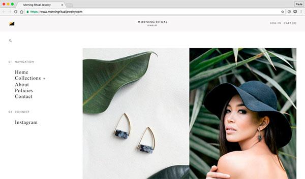
20.
Online store THING IND. offers non-standard products for the home. The concept is reflected in the design of landing pages. On the site, instead of black, a dark blue font is chosen (including for navigation). The designers have created a relaxed atmosphere that is not typical for the eCommerce industry.

21.
Soap Co. the product is served in such a way that it “sells itself”. There are no advertising elements - only photos and text. A great example of minimalism in design.

22. RSVP
Rich, stylish design. There are many elements, but attention is not scattered. Even the corners are occupied - they contain the abbreviation of the brand.

23. Ratio
The design conveys the essence of the offer: high-quality coffee equipment. Each product has its own landing page, with a list of functions and benefits. The design pleases with high-quality photographs, well-thought-out colors, competent play with and typography.

24.
The Frank Body online store offers modern skin care products. Since the target audience is young people, the design of the site is appropriate. The effect is achieved with a monotype font and pastel colors.

By the way, from now on you no longer need to open the Google Fonts service to get third-party fonts, because now fonts are connected directly from .
We have added all the fonts from the Google Fonts collection to the visual gallery, and all you need to do is select the appropriate font, click on the connect button and use it for new or already placed texts on the landing page.

25. Rest.
rest. sells handmade stationery. The design concept conveys the solidity, orderly life of wealthy people - this is achieved by good product photos and small selling texts.